



Dimensional Letters vs. Flat-Cut Acrylic Signs: Which Interior Sign Style Fits Your Brand?
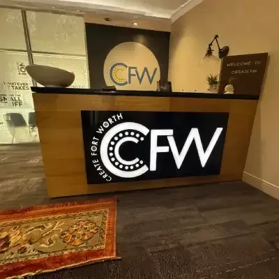
Walk into most lobbies in the Metroplex and you will see one of two sign styles behind the reception desk: raised dimensional letters t that cast a shadow off the wall, or flat-cut acrylic letters mounted flush with almost no depth at all. Both create a clean, professional first impression, but they send a slightly different signal about your brand before a single word is spoken. This guide compares the two styles, adds indoor illuminated signs into the mix, and walks through how corporate offices and medical practices tend to choose.
What Are Dimensional Letters?

Dimensional letters are three-dimensional signs, letters, and logos cut from acrylic, metal, or PVC and mounted with standoffs so they sit slightly off the wall. The gap between the letter and the wall creates a visible shadow line that shifts as the light in the room changes, giving the sign a sense of depth and permanence that a flat, printed sign cannot match.
Because they are fabricated piece by piece, dimensional signs can use brushed metal faces, painted acrylic, or a combination of finishes within the same word mark, which makes them a common choice when a brand's logo has more than one color or material in its identity.
What Are Flat-Cut Acrylic Signs?
Flat-cut acrylic signs are letters or logos cut from a single sheet of acrylic and mounted nearly flush against the wall, with little to no standoff gap. The finished look is clean and minimal, with almost no shadow, which makes it read as understated rather than dimensional.
Acrylic signs are typically less expensive to produce than multi-layer dimensional letters, since there is only one material and one cut involved rather than a layered, standoff-mounted assembly. That makes them a practical option for smaller offices, single-suite tenants, or any brand that wants a polished look without the added depth.

Adding Indoor Illuminated Signs to the Comparison
Both dimensional letters and flat-cut acrylic signs can be built as indoor illuminated signs, with LED modules placed behind the letters or logo to backlight the wall in the same halo effect used on exterior channel letters. Illumination adds cost and a low-voltage power connection to the wall, so it tends to show up most in larger corporate lobbies, medical waiting areas, and hospitality spaces where the reception wall doubles as a design feature rather than just a name plate.
For smaller offices or interior suites without a dramatic double-height lobby, non-illuminated dimensional letters or acrylic signs usually deliver the same brand impact for a lower overall investment, since ambient lighting in the space already does the work that backlighting would otherwise provide.
Dimensional Letters or Acrylic: Which Fits Your Lobby?
The decision usually comes down to how much visual weight your reception wall can support and how your brand identity is built. A logo with texture, multiple materials, or a wordmark meant to feel substantial reads best as dimensional letters. A simpler, single-color wordmark or a smaller lobby signs installation in a compact suite often looks cleaner as flat-cut acrylic, without competing for attention against artwork or branding already on the wall.
Ceiling height matters as well. A double-height lobby with a large blank wall can carry the visual weight of large-format dimensional letters without looking sparse, while a standard eight or nine-foot ceiling in a smaller suite often looks better with a modestly sized acrylic sign that does not overwhelm the space.
Interior Signage for Corporate & Office Environments
Corporate and office tenants generally lean toward dimensional letters for the main reception wall, since the shadow line and material depth reinforce the sense of an established company the moment a visitor or client walks in. Our Corporate & Office sign work for DFW businesses typically pairs a dimensional wordmark at reception with flat-cut acrylic for secondary wayfinding, conference room nameplates, and directory signs, keeping cost proportional to how visible each sign is to visitors.
A hybrid approach is also common in larger corporate suites: a dimensional wordmark at the main reception wall, paired with flat-cut acrylic suite numbers and directory panels down the hallway. This keeps the biggest brand investment where visitors spend the most time looking, while secondary wayfinding stays simple and inexpensive to update as the company grows or reorganizes floors.
Interior Signage for Medical & Healthcare Practices
Medical and healthcare clients tend to favor a slightly different mix. Waiting areas and check-in desks often use dimensional letters for warmth and permanence, while exam room and department signage throughout the rest of the building uses flat-cut acrylic for a clean, clinical look that is easy to update if a department or provider changes. Our Medical & Healthcare sign packages are built around that split, since patient-facing areas benefit from a warmer first impression while back-of-house signage benefits from a simpler, more replaceable format.
Neither style is the automatically correct choice. The right one is the one that matches the wall it will live on, the industry it needs to speak to, and the brand file it needs to represent accurately, which is exactly what the next few sections walk through in detail.
Materials and Finishes: What Each Style Offers
Dimensional letters open up a wider range of finishes because each letter is fabricated as its own piece. Brushed aluminum, painted acrylic, wood veneer faces, and mixed-material combinations, such as a metal letter with an acrylic logo mark beside it, are all common on a single dimensional sign. That flexibility is part of why dimensional letters cost more: the fabrication process is closer to building several small sculptures than cutting one sheet of material.
Flat-cut acrylic signs are more limited in finish but not in color. Acrylic comes in a wide range of solid colors, translucent tones, and painted-back finishes, so a brand with a specific color palette can usually match it closely even within a single-material sign. The trade-off is texture: acrylic reads as smooth and flat rather than layered, which is either a feature or a limitation depending on the brand identity behind it.
Maintenance and Longevity Indoors
Both sign styles hold up well indoors, since neither faces the heat, UV exposure, or storms that exterior channel letters and monument signs deal with outside. Dimensional letters with standoff mounting occasionally need a light cleaning behind the letter where dust collects in the gap, while flat-cut acrylic, mounted flush, has no gap to collect dust in the first place.
The more common maintenance question is not cleaning but updating. If a company rebrands or a tenant changes suites, flat-cut acrylic is generally faster and less costly to remove and replace than a dimensional sign with standoff hardware anchored into the wall, which is worth factoring in for any tenant on a shorter lease term.
How to Choose Between the Two Styles
Start with your logo. If it relies on texture, layered materials, or a bold three-dimensional feel in your brand guidelines, dimensional letters are the more faithful translation onto a wall. If your identity is simple, flat, and color-based, flat-cut acrylic will reproduce it accurately without adding a visual element your brand guide never called for.
From there, weigh your reception wall's size, whether the space calls for illumination, and how your industry's visitors typically read a lobby. A five-minute walk-through with your sign provider, measuring the wall and reviewing your logo files together, usually settles the decision faster than debating it from photos alone.
Budget plays a role too, but it should come after the brand and space questions, not before them. Choosing acrylic purely to save cost on a wall that clearly calls for dimensional letters, such as a large double-height lobby with a premium brand identity, often reads as a mismatch to visitors who expect the sign to match the scale of the space. In those cases, a smaller dimensional sign is usually a better outcome than a full-width acrylic sign trying to fill the same wall.
LOBBY SIGN QUESTIONS DFW BRANDS ASK BEFORE THEY BUILD
What is the difference between dimensional letters and flat-cut acrylic signs?
Dimensional letters are mounted with a standoff gap that creates a shadow and a sense of depth, while flat-cut acrylic signs sit nearly flush against the wall with little to no shadow. Dimensional letters read as more substantial; acrylic signs read as clean and minimal.
Are dimensional letters more expensive than acrylic signs?
Dimensional letters are generally more expensive than flat-cut acrylic signs because they involve standoff mounting hardware and often multiple materials or finishes, while acrylic signs are cut from a single sheet with a simpler installation.
Can dimensional letters or acrylic signs be illuminated?
Yes, both dimensional letters and flat-cut acrylic signs can be built as indoor illuminated signs with LED backlighting behind the letters. Illumination adds cost and typically shows up most in larger lobbies where the reception wall is a design feature.
Which interior sign style works best for a medical office?
Medical offices often use dimensional letters at the check-in desk for a warmer first impression and flat-cut acrylic for exam room and department signage, since acrylic signage is easier and less costly to update when departments change.
Do flat-cut acrylic signs look less professional than dimensional letters?
No. Flat-cut acrylic signs read as clean and minimal rather than less professional, and they are often the better fit for smaller suites or simple, single-color brand identities that do not need added depth.
How do I decide which lobby sign style fits my brand?
The clearest starting point is your logo file. Textured or multi-material logos translate more accurately into dimensional letters, while simple, flat, color-based logos reproduce accurately as flat-cut acrylic without adding an element your brand guidelines never specified.