


How Big Should Your Business Sign Be? Letter Height and Viewing Distance for DFW Storefronts
Key takeaways
Sign letter height is the height of the capital letters on your sign, and it sets how far away people can read it.
Head-on signs (monument, pylon, blade): about 1 inch of letter height per 30 feet of distance.
Wall signs viewed at an angle (channel letters on a storefront): about 1 inch per 10 feet, or use the wall sign formula in Step 2.
Speed matters more than most people expect. A driver at 40 mph covers about 59 feet every second.
All-caps text needs about 15% taller letters, and internally lit signs read from farther away than signs lit from outside.
Your city and your landlord set the legal maximum. The math tells you what is readable; the permit tells you what is allowed.
In this guide
Why sign charts disagree: 1 inch per 30 feet or 1 inch per 10 feet?
Sign letter height and viewing distance chart
Step 1: Work out how far away drivers start reading
Step 2: Wall signs read differently than monument signs
Step 3: Adjust for capitals, contrast, lighting and clutter
Step 4: Check what your city and landlord will allow
Worked example: a DFW strip center storefront
Common sizing mistakes
How we size signs at Elevated Exposure
Frequently asked questions
Why Sign Charts Disagree: 1 Inch per 30 Feet or 1 Inch per 10 Feet?
If you have searched for a letter height chart, you have probably noticed the numbers do not match. One sign shop says a 3-inch letter reads from 30 feet. Another says 90 feet. A third says 120. They are not all wrong. Most of them are answering different questions without saying so.
The sign industry measures readability with a number called the legibility index. The legibility index (LI) is the distance in feet at which a sign can be read for every inch of capital letter height. An LI of 30 means a 1-inch letter can be read from 30 feet, a 10-inch letter from 300 feet, and so on.
The United States Sign Council uses an LI of 30 as its average for signs that face the viewer, which it calls perpendicular signs. Its research also found that parallel signs, meaning letters mounted flat on a building wall, face a threefold disadvantage. A driver only starts reading a wall sign once the angle of view opens past roughly 30 degrees, so the useful reading window is much shorter. To make up for that, USSC applies a multiplier of three, which drops the effective LI for wall signs to about 10.
That is where the two popular rules come from. The "1 inch per 10 feet" figure you see on many sign company charts lines up with the wall sign case, while "1 inch per 30 feet" is the average for a sign that faces you. Use the wrong one and you either pay for letters three times bigger than you need on a monument, or you install storefront letters that cannot be read from the road.
Sign Letter Height and Viewing Distance Chart
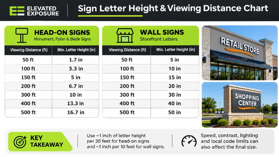
Use this chart as a starting point. It shows the minimum capital letter height for mixed-case copy (initial capitals with lowercase) at common distances, using the USSC average LI of 30 for head-on signs and the parallel-sign LI of 10 for wall signs.
Viewing distance | Head-on sign (monument, pylon, blade) | Wall sign seen at an angle (storefront letters) |
|---|---|---|
50 ft | 1.7 in | 5 in |
100 ft | 3.3 in | 10 in |
150 ft | 5 in | 15 in |
200 ft | 6.7 in | 20 in |
300 ft | 10 in | 30 in |
400 ft | 13.3 in | 40 in |
500 ft | 16.7 in | 50 in |
Three notes before you use it. These are minimums, so treat them as the smallest letter that will be read, not the size that will be noticed. If your sign is all capitals, add about 15%. And for wall signs, the chart is a rough shortcut; Step 2 gives you a better formula based on your actual lane count and setback.
To calculate it yourself, divide the viewing distance in feet by the legibility index. A monument sign that needs to be read from 240 feet works out to 240 / 30 = 8-inch letters.
Step 1: Work Out How Far Away Drivers Start Reading
The chart needs a viewing distance, and this is where most sizing goes wrong. The right distance is not how far the building is from the road. It is how far away a driver needs to be when they first read your name, so they still have time to slow down, signal and turn in.
USSC calls this the viewer reaction distance, and the formula is simple: speed in miles per hour, times 1.47 (to convert to feet per second), times the viewer reaction time in seconds. For reaction time, USSC estimates about 8 seconds for drivers under 35 mph on simple two or three lane streets, about 10 seconds above 35 mph on busier four or five lane roads, and 11 to 12 seconds on high-speed multi-lane roads. Those times include the few seconds a driver needs to actually make the turn.
DFW road type | Speed | Reaction time | Reading distance | Letter height for a head-on sign (LI 30) |
|---|---|---|---|---|
Two-lane retail street or town center | 30 mph | 8 sec | about 353 ft | about 12 in |
Four-lane arterial | 40 mph | 10 sec | about 588 ft | about 20 in |
Six-lane arterial | 45 mph | 10 sec | about 662 ft | about 22 in |
Highway frontage road | 55 mph | 11 sec | about 889 ft | about 30 in |
Those numbers surprise people. A full decision distance on a busy DFW arterial calls for letters around 20 inches tall on a freestanding sign, and very few small business signs are that big. That does not mean a smaller sign is useless. It means the sign gets read later, so the driver has less time to react, and some will miss the turn and come back around (or not come back at all).
In practice, we treat the decision distance as the target for the business name only. Secondary copy like a tagline, phone number or list of services is read from much closer, usually by people who are already pulling in, so it can be far smaller.
Step 2: Wall Signs Read Differently Than Monument Signs
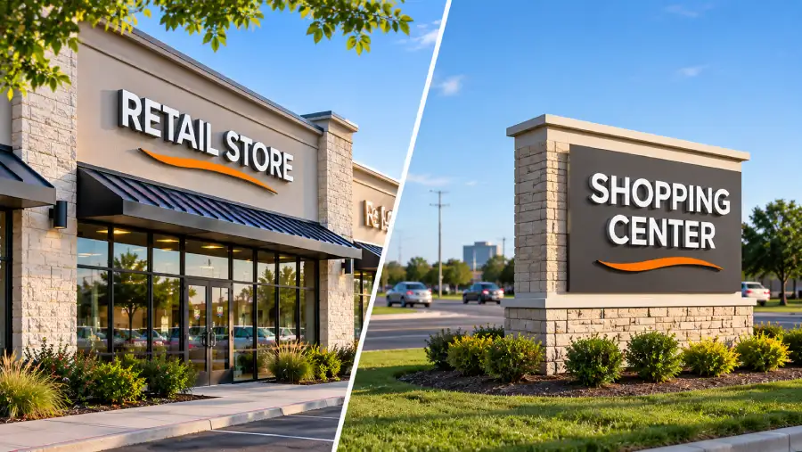
Storefront letters are the sign type most DFW businesses get, and they are the easiest to undersize. Because the letters sit flat against the building, a driver passing on the main road sees them at a sharp angle until they are almost level with the store. USSC's research puts the starting point for legibility at an angle of about 30 degrees to the driver's line of sight, with the best reading between 30 and 60 degrees.
Rather than guessing a distance, USSC gives a formula for wall signs that uses two things you can measure on site:
Letter height (inches) = (number of travel lanes x 10 + setback from the curb in feet) / 5
The setback is the distance from the edge of the road to the face of your building. Here is how it plays out on three typical DFW sites:
Site | Lanes | Setback from curb | Minimum letter height |
|---|---|---|---|
Pad site close to a two-lane street | 2 | 40 ft | 12 in |
Strip center behind a parking field | 4 | 120 ft | 32 in |
Big-box or deep center on a six-lane arterial | 6 | 150 ft | 42 in |
Notice how fast the number grows with setback. Many retail centers in Fort Worth, Arlington and the mid-cities put two or three rows of parking between the road and the storefronts, and that is exactly what pushes the required letter height past what most tenants expect to pay for. If that sounds like your site, it is a good reason to also ask about a tenant panel on the center's monument sign, which faces traffic and works on the more forgiving head-on numbers.
Step 3: Adjust for Capitals, Contrast, Lighting and Clutter
Letter height is the biggest factor, but it is not the only one. Once you have a base number, adjust it for how the sign is actually built.
Capitals versus mixed case
USSC builds a 15% increase into its numbers when copy is set in all capitals, because mixed upper and lowercase words have more recognizable shapes. If your brand uses all caps, size up by 15%. If you have the choice, initial capitals with lowercase will read from farther away at the same height.
Lighting
Illumination changes legibility more than most owners realize. The USSC guideline reports that test track research found 40 to 60 percent longer reading distances with internally illuminated signs, and that an externally lit sign needs to be about 40% larger to match an internally lit one. That is one reason illuminated channel letters are the default for storefronts on busy roads: a front-lit or halo-lit letter set gives you more reading distance per inch, especially after dark. In December the sun sets in DFW before 5:30 p.m., so a good share of your evening traffic sees the sign lit, not in daylight.
Contrast, font and spacing
Pick a plain, bold sans-serif or a sturdy serif for the business name, and avoid thin scripts and condensed fonts on anything meant to be read from a car. High contrast between letters and background matters more than color choice. Dark letters on a light background or light letters on a dark background both work; two mid-tone colors next to each other do not. Leave room around the copy, too. USSC recommends that negative space make up about 60 percent of the sign area, so a sign packed edge to edge with text reads worse than a smaller one with breathing room.
Visual clutter
The same letter reads from a shorter distance on a busy commercial strip than on a quiet street. USSC applies an adjustment factor of 0.83 for moderately congested areas and 0.67 for highly congested ones, which lowers the average LI from 30 to 25 or 20. On a corridor lined with pole signs, banners and other storefronts, size up accordingly.
Step 4: Check What Your City and Landlord Will Allow
Everything above tells you how big your letters should be to be read. It does not tell you how big they are allowed to be. Those are separate questions, and in DFW the second one is answered by two parties.
The city sets the maximum sign area, and in most DFW cities that number is calculated from your building frontage and zoning district, so two storefronts on the same street can end up with different limits. Our Dallas sign permit guide and Fort Worth sign permit guide cover how each city handles it. If you lease space in a shopping center, the landlord's sign criteria usually add their own limits on letter height, sign band size, colors and lighting, and those apply even when the city would allow more. We cover how those documents work in our post on multi-tenant signage standards.
When the readable size and the allowed size do not match, you have options. Shorten the copy so the name can use the full height. Drop the tagline from the wall sign and move it to window graphics or the door. Choose internal illumination for the extra reading distance. Or add a second sign that faces traffic, like a monument panel or a blade sign, so drivers get a head-on view.
Worked Example: A DFW Strip Center Storefront
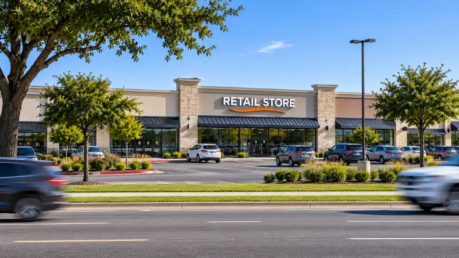
Here is how the four steps fit together on a typical site. This is an illustrative example, not a specific client project.
A new tenant is opening in a strip center on a four-lane arterial posted at 40 mph. The storefront sits about 150 feet back from the curb behind a parking field, and the business name is eight characters set in mixed case.
Wall sign minimum (Step 2): (4 lanes x 10 + 150 ft) / 5 = 38-inch capital letters.
Capitals (Step 3): the brand is mixed case, so no 15% increase. In all caps it would be about 44 inches.
Lighting (Step 3): internally illuminated channel letters give more reading distance than an unlit or spotlit sign, so the tenant goes with front-lit letters.
Allowed size (Step 4): the center's sign criteria cap letter height below 38 inches, which is common in older centers. The tenant uses the maximum allowed height, keeps the wall sign to the name only, and moves the services list to window vinyl.
Head-on backup: at 40 mph, a driver needs about 588 feet to read and react, which would take roughly 20-inch letters on a freestanding sign. The tenant panel on the center's monument is smaller than that, so it will be read later, but it still gives drivers a head-on view that the wall sign cannot.
The result is not the 38-inch sign the formula asked for, but it is the most readable sign the site allows, and the owner knows why. That is the point of doing the math before the design: you make the trade-offs on purpose instead of finding out after installation.
Common Sizing Mistakes
Measuring from the parking lot. The people you need to reach are on the road, not in the lot. Measure from the travel lanes.
Using the 10-foot rule for a monument sign. Head-on signs read about three times farther per inch than wall signs, so wall sign rules oversize freestanding signs and waste budget.
Using the 30-foot rule for wall letters. The opposite mistake, and the more common one. Storefront letters sized like a monument sign end up too small to read from the road.
Giving the tagline equal billing. Every extra line shrinks the business name. Put the name first and move the rest to secondary signs.
Forgetting about night. A sign that reads well at noon can disappear at 7 p.m. in December. If evening traffic matters to your business, plan for illumination from the start.
How We Size Signs at Elevated Exposure
Before I started Elevated Exposure, I built a career in urban planning and economic development, including community engagement work with the Minnesota Department of Transportation, and I hold a Master of City and Regional Planning from UNC Chapel Hill. That background shapes how we size signs. We look at the road first and the wall second.
On a site survey, we note the posted speed, count the lanes, measure the setback from the curb, and check sight lines from both directions of traffic. Then we check the sign ordinance and any landlord criteria before we draw anything, so the size we propose is one that can actually be permitted. If you want to see what the numbers mean for your building, our team can put together a sizing recommendation as part of an exterior building signage project.
[CLIENT TO CONFIRM: add one real DFW project here, for example the Victory City Cycles raceway-mounted letters, with the setback, lane count and final letter height used.]
Frequently Asked Questions
How big should sign letters be to read from 100 feet?
For a sign that faces the viewer, about 3.3 inches of capital letter height reads from 100 feet, using the USSC average legibility index of 30. For letters mounted flat on a wall and seen at an angle, plan on about 10 inches. Add 15% if the text is all capitals.
What is the standard letter height for an outdoor business sign?
There is no single standard, because the right height depends on viewing distance, traffic speed and how the sign is mounted. The most used rule of thumb is 1 inch of letter height per 30 feet for head-on signs and 1 inch per 10 feet for wall signs. Your city and landlord then set the maximum.
How far away can you read a 3-inch letter?
A 3-inch capital letter on a head-on sign reads from about 90 feet at an LI of 30. On a wall sign seen at an angle, the practical distance is closer to 30 feet. Contrast, lighting and font can move that number up or down.
How do I calculate letter height for a sign?
Divide the viewing distance in feet by the legibility index: 30 for head-on signs, about 10 for wall signs. For storefront letters, a better method is (number of lanes x 10 + setback from the curb in feet) / 5, which gives the minimum letter height in inches.
Do lighted signs need smaller letters?
They can be smaller for the same reading distance. USSC research found internally illuminated signs were read from 40 to 60 percent farther away in test track studies, and that externally lit signs need to be about 40% larger to match them.
Does all caps make a sign easier to read?
No. Mixed upper and lowercase text is easier to read at a distance, and USSC builds a 15% increase in letter height into its numbers for all-caps copy. If your logo is all capitals, size up to compensate.
Size for the Road, Not the Wall
A sign that cannot be read in time does very little for the business behind it. Start with the road: the speed, the lanes and the distance from the curb. Pick the right rule for the type of sign, adjust for capitals and lighting, and then check it against what the city and your landlord allow. If you would like a second set of eyes on the numbers, request a free estimate and we will include a letter height recommendation for your site. For the broader planning picture, see our guide to planning exterior building signage in Fort Worth.