



How to Prepare Your Logo for a Commercial Sign
By Keith Mensah, founder of Elevated Exposure.
The logo file you use on your website is almost never the file a sign shop can build from. A 600-pixel PNG looks fine on a phone. Blown up to a six-foot wall of channel letters, it turns into soft edges and guesswork.
Short answer: to prepare your logo for a commercial sign, send a vector file (AI, EPS, SVG, or a PDF saved from Illustrator with fonts converted to outlines), your exact brand colors as Pantone or paint references, and a simplified version of the logo if the full one has a tagline, fine lines, or small text. Then review a scaled proof before anything is fabricated.
The rest of this guide follows the order a Dallas Fort Worth sign project actually runs, including the checks that matter for lit signs and that most logo guides skip.
Key takeaways
A vector file is the starting point. A JPG saved as a PDF is still a JPG.
Logos built for business cards often need a simpler sign version: fewer words, thicker lines, one lockup that fits the wall.
Channel letters have minimum stroke widths. Thin script and hairline details may need to change or move to a backer panel.
Brand colors shift when light shines through them. Ask to see a lit sample before you approve a lit sign.
The approved proof or shop drawing is what the city, the landlord, and the fabricator all work from.
What File Does a Sign Company Need for Your Logo?
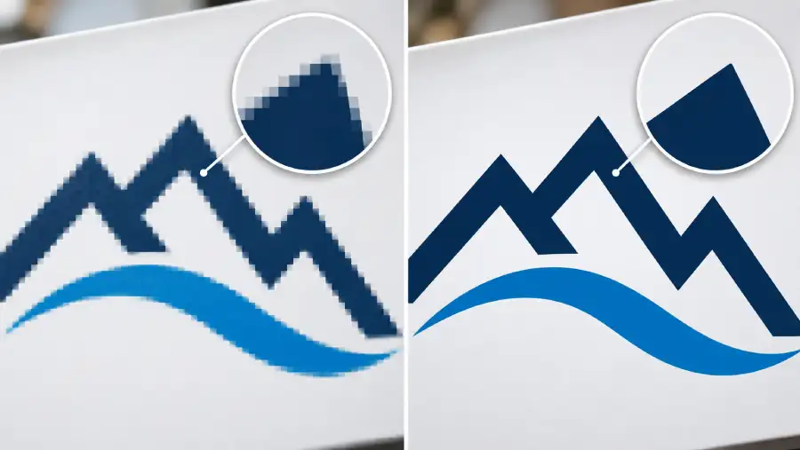
Sign shops need vector artwork. A vector file describes your logo as shapes and paths instead of pixels, so it can scale from a door decal to a 30-foot fascia without losing an edge. It is also what fabrication equipment reads. Routers, laser cutters, and vinyl plotters follow those paths to cut letters, faces, and returns.
The formats that usually qualify:
AI (Adobe Illustrator), the native working file most designers keep.
EPS, an older format that is still common in print and sign work.
SVG, which is often what logo builders and AI design tools export.
PDF, but only when it was saved from vector software and still contains paths.
Raster formats (JPG, PNG, GIF, WebP) are made of pixels. They work for screens and for printed photography at the right resolution, but a router cannot cut a letter out of pixels.
Two details trip people up. The first is fonts. If the file still uses live type and the shop's computer does not have that exact font, the software quietly swaps in another one. Ask your designer to convert all text to outlines before sending. The second is that the file extension can lie. Opening a JPG and choosing Save as PDF or Save as EPS wraps the same pixels in a new container. Nothing becomes vector.
A quick test: open the file and zoom to 800 percent or more. If the edges stay crisp no matter how far you zoom, it is probably vector. If they turn into stair-steps or blur, it is raster.
Where to Find Your Vector Logo
Most businesses already have a vector logo somewhere. They just do not know which inbox or folder it is in. Before you pay anyone to redraw it, check these sources:
The designer or agency who created the logo. Ask for the master files or source files, not the web versions.
A brand guidelines PDF, which often has the vector logo embedded in it.
The printer who made your business cards, shirts, or vehicle graphics. They needed vector art too.
Your web developer, who may have an SVG version running on the site.
For franchises, the franchisor's brand portal, which usually holds approved sign artwork.
If none of those turn up a usable file, the logo can be redrawn. A clean geometric logo is a short job. A detailed illustration or hand-lettered mark takes longer, and the redraw should be compared against the original line by line. Once the vector file exists, store it where your whole team can find it. You will need it again for the next sign, the next wrap, and the next trade show backdrop.
Simplify the Logo for the Sign, Not the Business Card
A logo that reads well two inches wide on a business card can fall apart on a building. People see a sign from a moving car or across a parking lot, often for only a few seconds. A few adjustments make a big difference.
Pick one lockup
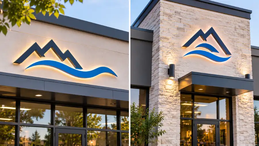
Many logos come in a horizontal version and a stacked version. The shape of the wall decides which one fits. A long, short fascia above a strip-center storefront usually wants the horizontal lockup. A narrow tower element or a monument sign often fits the stacked one better.
Drop the small stuff
Taglines, phone numbers, founding years, and trademark symbols rarely survive the distance. If the tagline matters to your brand, give it its own line at a size people can actually read, or move it to a window graphic at eye level where pedestrians will see it.
Size for the distance, not the wall
Letter height should follow how far away your customers are when they need to read the sign, not how much wall is available. Our guide to sign letter height and viewing distance has the chart we use on DFW projects.
Check the landlord criteria first
Shopping centers and office parks often set maximum letter heights, an approved color palette, or a rule that a logo icon can only take up part of the sign area. Getting the tenant criteria before design starts saves you from paying for a design the property manager will reject.
Channel Letters and Lit Signs: The Stroke Width Check
This is the step generic logo guides skip, and it is where most sign redesigns start. Stroke width is the thickness of the lines that make up each letter or shape. Channel letters are hollow shapes with LEDs inside, so every stroke has to be wide enough to hold the lighting and let it spread evenly across the face.
Fabricators set their own limits, and they vary by letter style and equipment. One manufacturer's published design guidelines call for a minimum stroke of 1 1/4 inches on front-lit letters, with 1 1/2 inches preferred, and letters no smaller than about 8 inches tall. The same guidelines prefer 2-inch strokes on halo-lit letters so the LEDs throw enough light onto the wall. A fabricator writing in Signs of the Times lists 3/4 inch or larger as the recommended stroke for the trimless letters his shop builds in-house. The point is not one magic number. It is that your logo has to be checked against the specific letter style you are buying.
What this means for your logo:
Thin script, hairline serifs, and fine outlines may not fit LEDs at the letter size your budget and the sign code allow.
Gradients, drop shadows, and glow effects cannot be built as channel letters. They need a printed face or a flat panel.
Small counters (the enclosed spaces in letters like e, a, and R) can close up visually once the letter is lit.
There are good fixes. The logo icon can sit on a lit cabinet or backer panel while the business name is built as channel letters. A delicate mark can be push-through acrylic set into a routed aluminum face. Or the troublesome part can be non-lit dimensional letters washed by a light from above. Our channel letter signs page walks through the construction types, and we will tell you plainly if your logo needs adjusting before you see a price.
Brand Colors: Pantone, Vinyl, and How They Look at Night
Screens show color in RGB, printers use CMYK, and signs are made of paint, vinyl film, and acrylic. None of those match each other by default. The way to keep your brand consistent is to give the sign shop a fixed reference, usually a Pantone (PMS) number from your brand guide. Without one, the shop is matching a color off a monitor, and every monitor shows it a little differently.
Lit signs add another variable. Internally illuminated faces often use translucent vinyl films, which come in a set range of standard colors plus custom options. 3M's translucent graphic film line, for example, lists more than 75 standard colors made for both daytime and illuminated viewing. Your exact Pantone may land on a close standard color or need a custom match, and it is fair to ask which one you are getting.
Color also behaves differently with light behind it. A deep navy can read almost black at night. Some reds turn pinkish when backlit, and pale yellow can wash out against white LEDs. For any illuminated sign, ask for a lit sample of the face color, or at minimum a night rendering on the proof. That question costs nothing to answer before fabrication and a lot to fix after install.
Non-lit signs are simpler. Painted aluminum and dimensional letters can usually be matched to a Pantone or to a paint system the shop uses. If your logo is going on a stone or brick monument sign, bring a photo of the base material so the colors work against it, not just against a white screen.
Proofs, Shop Drawings, and Permits
Before anything is cut, you should approve a proof. For a simple panel, that might be a flat layout with dimensions and colors. For channel letters and monument signs, it is usually a shop drawing: a scaled drawing that shows letter heights, overall size, materials, colors, lighting, mounting method, and a photo mockup of the sign on your actual building.
Read the proof slowly. Check the spelling, check that the logo was not stretched or redrawn wrong, and check the dimensions against what your landlord allows. Approving a proof means approving that exact sign, so this is the moment to speak up.
The shop drawing does more than confirm the design. Landlords and property managers usually want it before they sign off, and sign permit applications in Dallas and Fort Worth typically ask for drawings showing the sign's size and placement on the building. Our Fort Worth sign permit guide and Dallas sign permit guide explain what each city asks for. A clean vector logo makes those drawings faster to produce and more accurate.
Logo Prep Checklist Before You Request a Quote
A vector logo file (AI, EPS, SVG, or vector PDF) with all text converted to outlines.
Brand colors as Pantone numbers, or paint references if your brand guide has them.
Your preferred lockup (horizontal or stacked) and a version without the tagline, if one exists.
Photos of the wall or site, with rough measurements if you can get them safely.
The landlord's sign criteria or tenant design guidelines, if you lease.
Whether you want the sign lit, and whether customers mostly see it by day or by night.
Any logo changes on the horizon. If a rebrand is coming, finish it before you order the sign.
Send that package with your free estimate request and the first proof will land much closer to final.
Frequently Asked Questions
What file format do sign companies need for a logo?
A vector file: AI, EPS, SVG, or a PDF exported from vector software with fonts converted to outlines. Vector files scale to any size and give fabrication equipment the paths it needs to cut letters and faces. Raster files like JPG and PNG are fine for screens but cannot be cut into letters.
Can I just save my JPG as a PDF or EPS?
No. Saving a raster image in a vector format keeps the same pixels inside a new file type, so the edges still blur when enlarged. A designer has to redraw the logo as vector paths for it to work on a sign.
What if I don't have a vector version of my logo?
Check with your original designer, your printer, and your web developer first, because one of them usually has it. If no one does, the logo can be redrawn from the best image you have. Keep the new file somewhere safe, since every future sign and print job will need it.
Can any logo be made into channel letters?
Most logos can, but some need adjustments. Thin script, fine outlines, gradients, and very small text often fall below a fabricator's minimum stroke width or cannot be lit evenly. Common fixes are thickening strokes, placing the icon on a lit panel, or building part of the sign as non-lit letters.
Will my sign match my brand colors exactly?
It can match closely when you provide Pantone references. Lit signs depend on translucent films and acrylics, so the color may land on the nearest standard shade or need a custom match. Ask to see a lit sample, because colors shift once light is behind them.
Can I see what my sign will look like before it is made?
Yes. You should get a proof or shop drawing with dimensions, colors, and a mockup of the sign on your building before fabrication starts. For illuminated signs, ask for a night view too. Do not approve it until the spelling, size, and colors are right.
Not Sure Your Logo Is Sign-Ready?
Send what you have, even if the file is a mystery. We will tell you whether it is ready for production, what needs to change, and which sign types suit it best. Elevated Exposure designs, builds, and installs exterior and interior signs across Dallas Fort Worth, and our Fort Worth sign company team handles everything from the first proof to the permit. Request a free estimate and include the checklist above.
Sources
3M, Scotchcal Translucent Graphic Film Series 3630, product information. 3m.com
Signs of the Times, Know Your Production Limitations for Channel Letters. signsofthetimes.com
Front-Lit and Halo-Lit Channel Letter Guidelines, sign manufacturer design toolkit. coda.io/@adam-doll/design-toolkit
Custom HTML/CSS/JavaScript